
Premium Custom Printing Design Tips for Cards and Books | PrintGild
Professional printing design guidance and print tips for custom cards, books, and packaging boxes:
Creating print-ready, visually stunning designs for your custom cards and publications is key to achieving a premium final product. Learn how to create print-ready designs for tarot cards, poker decks, affirmation cards, and more. Our expert design tips cover everything from file preparation to layout best practices, ensuring your Tarot, Poker, Affirmation, Flash Cards, and accompanying books look polished, professional, and true to your vision.
How to Prepare Print-Ready Artwork
A step-by-step checklist for submitting files that print perfectly: resolution, file types, fonts, text placement, and avoiding common mistakes. All artwork submitted for production must meet standard print specifications to ensure sharp, consistent results with no delays or reworks. We require a minimum resolution of 300dpi for all raster images and illustrations to prevent blurry edges, pixelated text, or faded details. All files must be set to CMYK color mode (not RGB) for accurate printed color matching; if you are only able to provide RGB files, our team will convert them to print-ready CMYK and match tones as closely as possible, though minor color shifts may still occur.
· For custom printing cards and books, please follow these specifications to ensure your files are production-ready and avoid delays or reworks:
Please include a 3mm bleed on all sides and keep all critical text, logos, and graphics within a 3mm safe area away from the trim line, so nothing gets cut off during production. All fonts must be embedded or converted to outlines to avoid missing font issues, and any special finishes like foil, embossing, or spot colors must be provided on a separate, dedicated layer or file—these elements cannot repeat in your main artwork. We also recommend flattening transparent effects and checking for hidden objects or leftover layers before final submission to keep your file clean and production-ready.
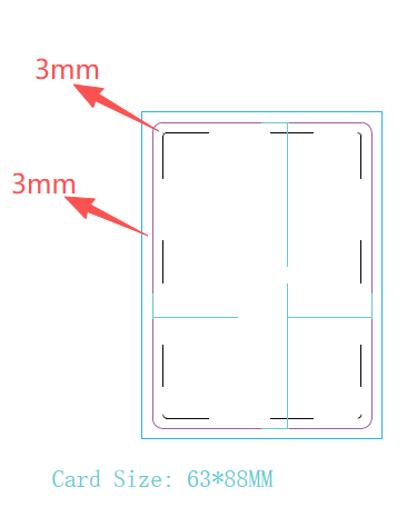
Template for cards
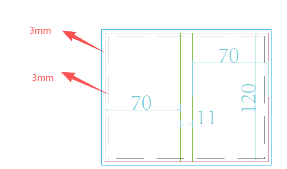
Template for books
· For custom packaging boxes, please follow these specifications to ensure your files are production-ready and avoid delays or reworks:
Please design your artwork strictly within our provided die-cut template boundaries, fill the entire designated layout area fully, and keep all critical text, logos, and graphics safely within the template’s marked safe zone — no 3mm bleed is required for box packaging. All fonts must be embedded or converted to outlines to avoid missing font issues, and any special finishes like foil, embossing, or spot colors must be provided on a separate, dedicated layer or file — these elements cannot repeat in your main artwork. We also recommend flattening transparent effects and checking for hidden objects or leftover layers before final submission to keep your file clean and production-ready.
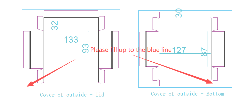
Designing Double-Sided Cards
Best practices for two-sided layouts, alignment, readability, and balancing visuals on front and back of Tarot, Poker, Affirmation, and Flash Cards. Double-sided design is standard for nearly all custom card sets, and consistent alignment across both sides is critical for a polished, professional finished product. Always use our provided template guides to lock trim lines, safe zones, and center alignment, so front and back elements stay perfectly positioned through cutting and finishing.
Avoid placing heavy text or dense graphics in the exact same spot on both sides, as this can create ghosting or show-through, even with premium opaque cardstock. Keep your style, color palette, font choices, and border rules consistent across the entire deck to maintain a cohesive look. For functional cards like Flash Cards and Poker decks, keep layouts predictable and easy to follow—use one side for key content and the other for supporting details without cluttering either side. For Tarot and Oracle decks, balance artwork and text so neither side feels overcrowded, and keep important elements safely within the non-trimmed area.
Font, Layout & Readability Tips
Ensure your text is clear, legible, and professional across all card types. We cover minimum font sizes, line spacing, color contrast, and balanced layout rules for Affirmation Cards, learning Flash Cards, message-focused decks, Tarot, and Oracle sets. The most common design issue that impacts finished quality is text that is too small, too cramped, or lacks enough contrast against its background.
We recommend a minimum 10pt font size for all body text and key messages, with 8pt only used for small legal lines or non-essential accents. Use open, comfortable line spacing to keep paragraphs easy to read, especially for longer affirmations, guide text, or study content. Always use high-contrast color pairs for text and background—avoid light text on light backgrounds or dark text on dark backgrounds, as they cause eye strain and reduce readability. For decorative or script fonts, only use them for headings or short accents, not full paragraphs, as they quickly become difficult to read at smaller sizes. Leave plenty of clean, empty space in your layout to let your text and artwork breathe; a crowded, overdesigned layout will weaken the premium look of your finished deck.